Real-time reporting
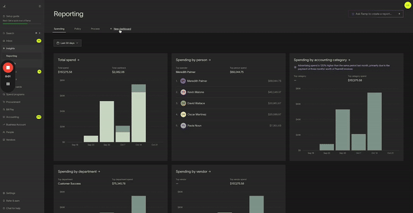
Ramp's real-time reporting shows company spend across all payment types in one place.
Note: Users only see the spend they have permission to view. For example, cardholders see their own spend, while managers and admins can see broader team or company spend based on their role.
Overview
Use Reporting to build saved reports, organize them into dashboards, and track spend across Cards, Reimbursements, and Bills. You can reuse saved reports, share individual reports with teammates, and export report data when your role has access.
Create and save reports
Custom reports let you save the views you use most often and organize them into custom dashboards.
- In the left panel, go to Insights > Reports .
- Build or open a report, then save it to an existing dashboard or a new custom dashboard.
- To create a copy of an existing report, open the report and click Save as new .
Saved reports and custom dashboards stay in Ramp until they are deleted. Unsaved changes do not persist.
Share and export reports
Available on Ramp Plus. See Ramp Plus overview for plan details.
Owner, Admin, Accounting, and Reporting Admin roles can share and export reports. Managers cannot use report sharing or exports.
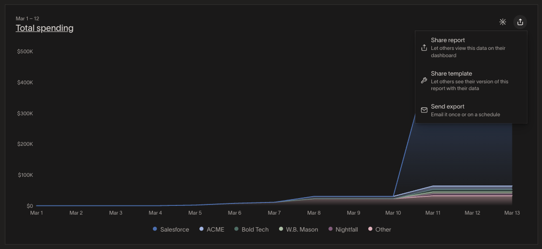
To share or export a report, open the report and click Share in the top right. You will see these options:
- Share report - Shares the report and its exact data. You can share it with Owner, Admin, and Accounting roles, and you can add a Reporting Admin from this flow.
- Share template - Shares the report's format so recipients only see the data they already have permission to view. You can share templates with anyone who has reporting access, including Managers.
- Send export - Emails report data to recipients. You can schedule the export and include a message. Exports include either Aggregated data (totals and groupings) or Raw data (row-level records).
Aggregated data exports only produce grouped output when the report uses a chart visualization such as bar, line, pie, area, or sankey. If the report uses the Data table visualization, the export contains row-level data regardless of which export option you choose.
You cannot share or export an entire dashboard. Sharing and exports are only available for individual reports.
Manage dashboards
You can rename or delete custom dashboards from the dashboard menu. Read-only dashboards, such as Shared with me or built-in dashboards, cannot be deleted.
- In the left panel, go to Insights > Reports and open the dashboard.
- Open the dashboard menu in the top right.
- Select Delete dashboard and confirm.
Deleting a custom dashboard also deletes the reports saved in that dashboard.
Import directly to excel
For the Excel add-in and direct import workflow, see Ramp for Excel.
Frequently asked questions
Can dashboards be shared?
No. Ramp only supports sharing individual reports, not entire dashboards.
How do I share a report with my team?
Open the report and click Share. Use Share report when recipients should see the exact data in your report, or Share template when recipients should only see the data they already have permission to access.
How do I duplicate a report?
Open the report and click Save as new. This creates a separate copy you can edit without changing the original report.
Can I duplicate a dashboard?
No. Ramp does not currently support duplicating an entire dashboard. If you need a copy of a report from that dashboard, open the report and use Save as new.
Can I create a report that shows approved bills scheduled for payment each month?
Yes. Reporting supports bill status and payment date fields, so you can build a bills report and group it by month. Ramp does not have a dedicated monthly payment frequency field in reporting, so use bill status and payment date filters to approximate approved or scheduled bill payments. If you need a table-first workflow for Bill Pay, see Advanced filtering on reporting tables.
Does Ramp save past created reports?
Saved reports and custom dashboards stay in Ramp until they are deleted. A report may seem to disappear if it was never saved, if it was moved to another dashboard, if you were viewing a shared report that was later unshared, or if you made changes to a read-only shared report without using Save as new.